J. Mörk Interior Architecture & Design
PERFECTLY
STAGED
LOGO RELAUNCH // PHOTOSHOOTING // WEBSITE RELAUNCH // CORPORATE IDENTITY

J. Mörk Interior Architecture & Design is planning the step from insider tip to local brand.
We take care of a completely renewed appearance. For this, we put together a complete package – with logo, stationery, photos of reference projects and website.
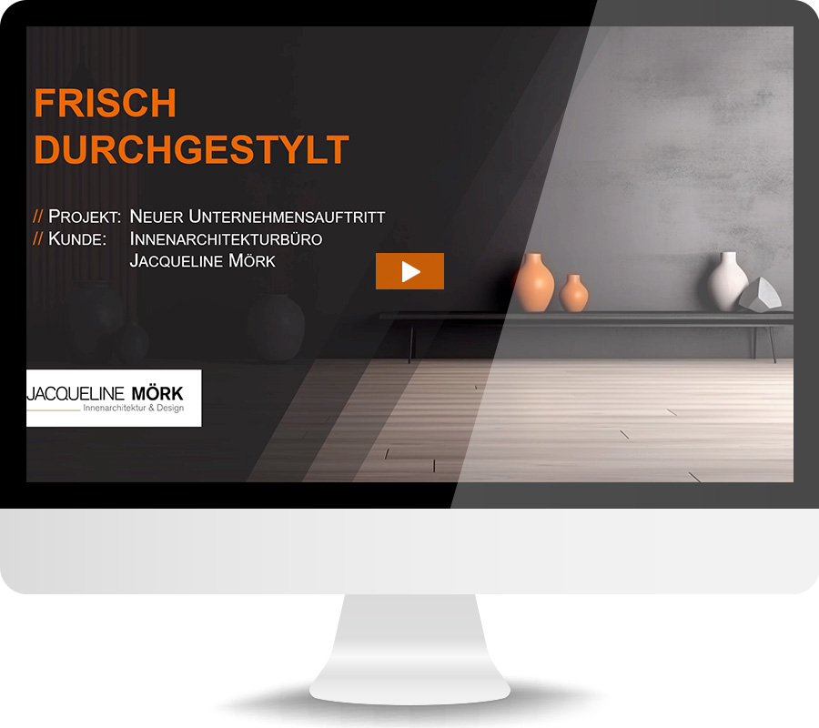
Find out more in the project clip (German only):
To protect your personal data, the connection to the video saved on Vimeo has been blocked. By loading the video, you accept Vimeo's privacy policy.
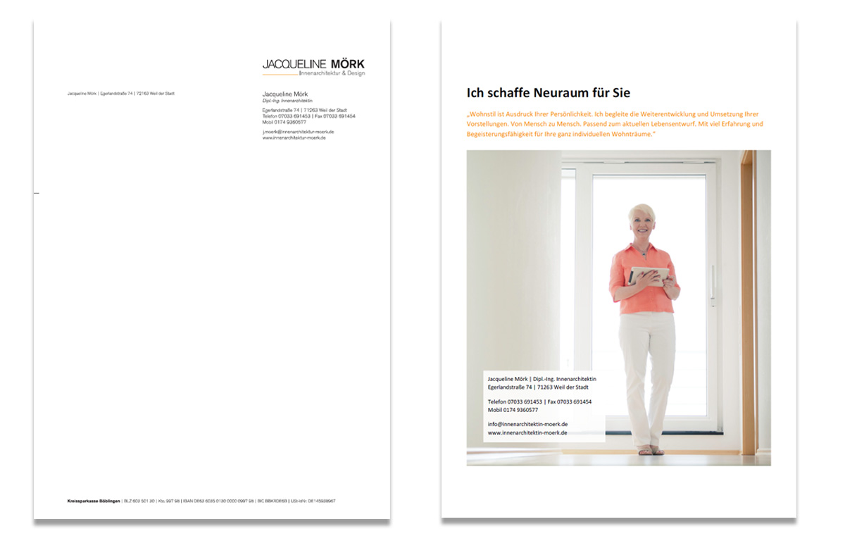
Attractive materials in combination with a new logo arm the customer for every situation in daily business.
The reduced and clear design of the LOGO reflects the philosophy of the client. With MEDIA specially adapted for individual use, the customer is prepared for every conceivable situation.
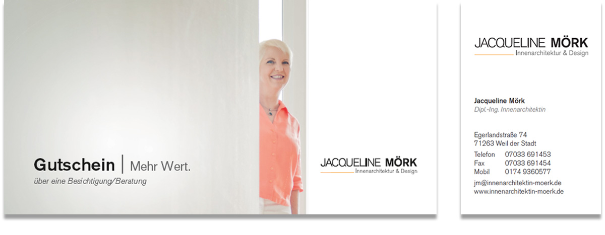
voucher
business card
stationery
cover sheet
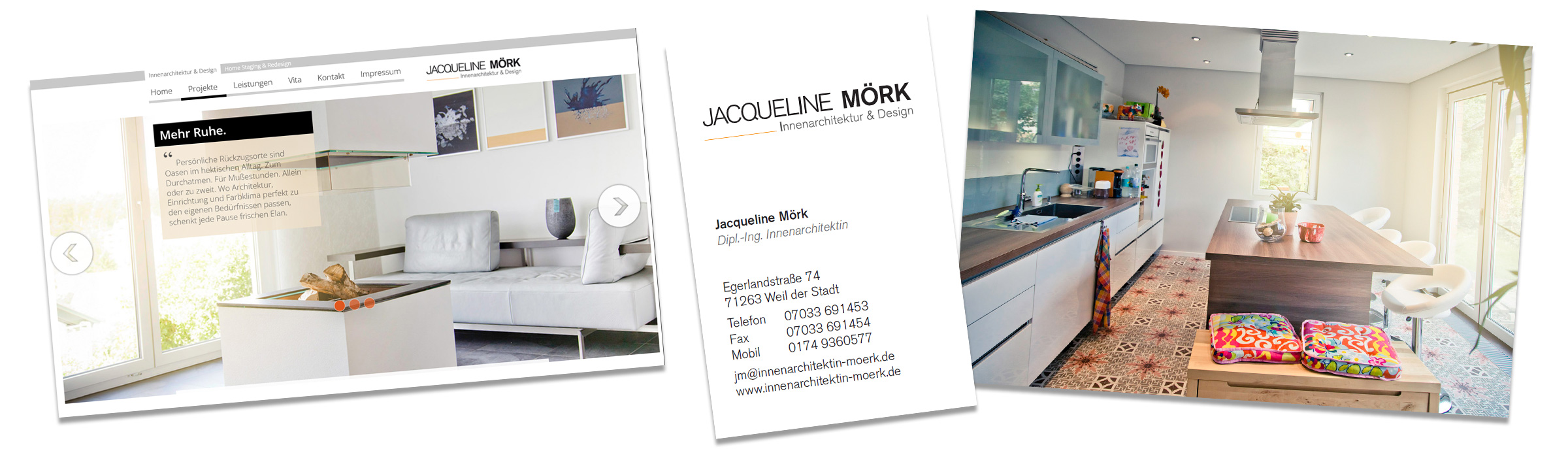
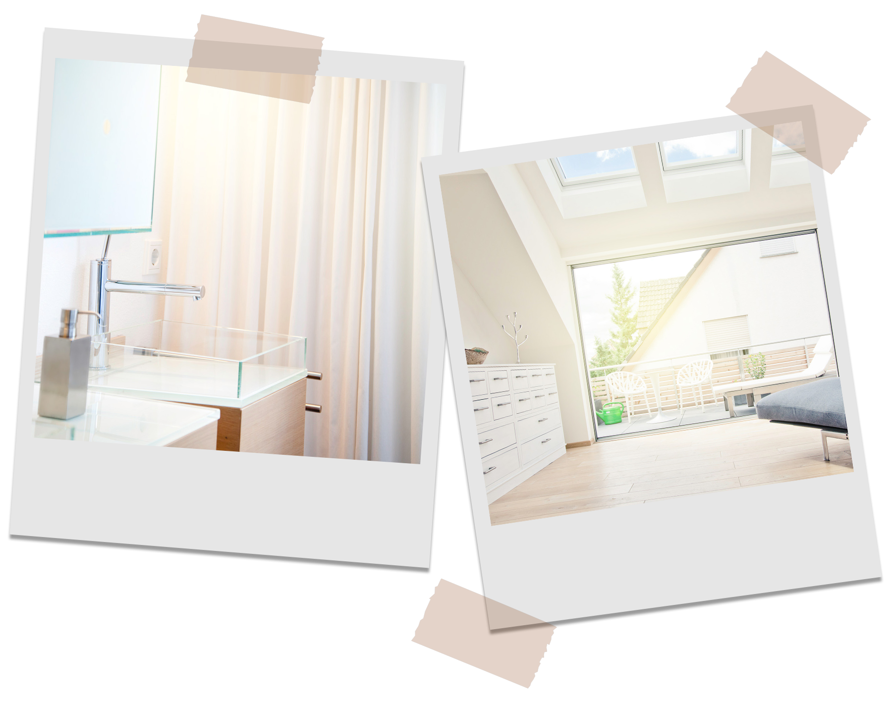
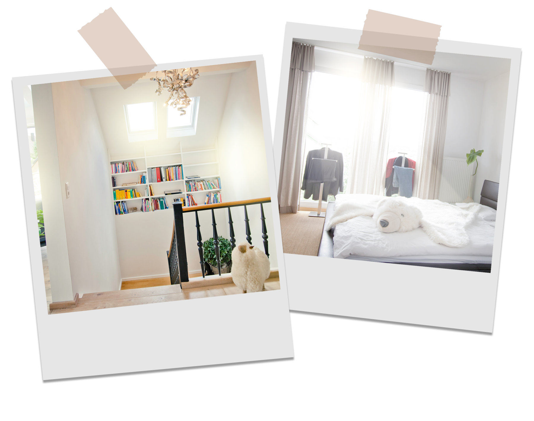
EMOTIONAL IMAGES speak directly to website visitors by showing exclusive insights into exciting projects. The images are designed bright and modern – they are diverse and underpin competence.
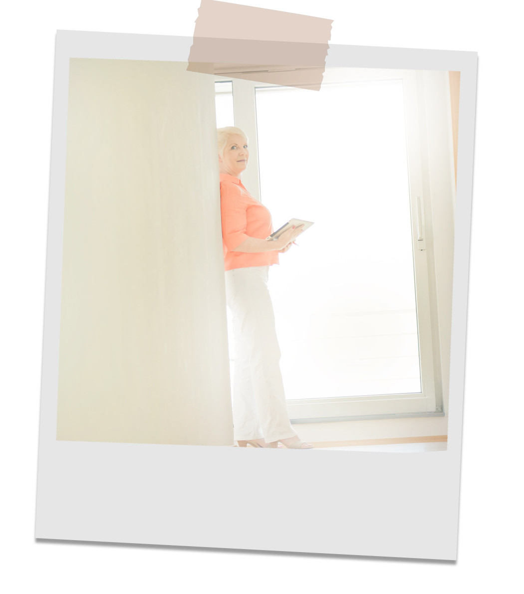
Portraits look authentic and sympathetic.
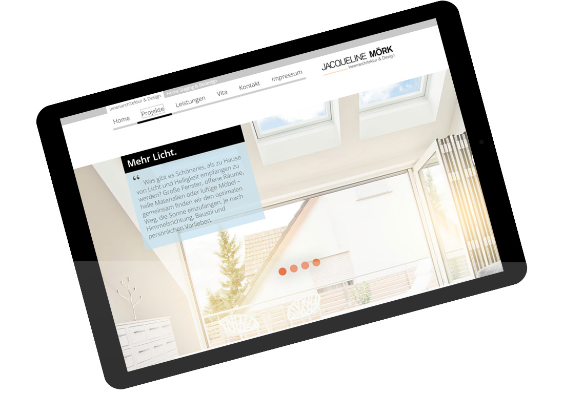
The NEW WEBSITE is striking and shines in fresh splendor. The gallery‑like look draws visitors into the site making the website a personal business card.

With Karg and Petersen, I can finally convey what really makes me tick. My customers are thrilled – and I enjoy a noticeably better reputation.”
Jacqueline Mörk
Owner // J. Mörk Interior Architecture & Design